
1)
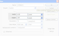
Create new document 615px X 105px:
2)
Create rounded rectangle similar to this one:

3)
Apply this settings to the shape (double click on layer):
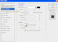
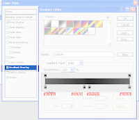
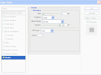
It should now look like this:

4) Now select font you like the most and create menu items that you need, use some light color, like white, this is how I did it:

5) Now select line tool set weight: 1px, color same as font (white?) and separate menu items as I did:
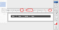
6) Select rectangle tool and draw sub menu for one (or more) of menu item, color of rectangle: #d6eed8, color of font on sub menu: black (#000000):

*You can add border to sub menu or/and create some custom shape to add accent to new menu on menu, this is how I did it:

It's always good idea to try something new, try other colors add something new, this is just a simple example!
I would like to see what you have done, please pass your work in comment,
thanks!
7 comments:
Image 4 does not show the settings for the Gradient Overlay - the Gradient Editor obscures the settings beneath it.
I rather like the way it came out, it took me a while seeing as the other comment was right about not being able to see what settings you had for gradient. Needless to say I toyed around until I got it to look like yours. Well anyway I have one question, now that I have made the header the way I would like how do I go about making the text into links on Photoshop?
Here's my current site DHSV7.2 AKA darksidehearts.com http://www.darksidehearts.com/DSHV7.html
As you can see I was kinda limited in terms of design when it came to it, so when I read your tutorial it got me to start to remake it. My friend who's a flash programmer, he told me that you can make incredible websites in Photoshop. So I find this to be an impressive set up the way you have it.
Post a Comment