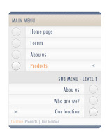
Let's create a pastel menu like this one:
1) Create new document, 300px X 370 px
2) Select round rectangle tool and set radius to 8px
Draw a rectangle approximately 245px X 50
You should have something like this:
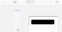
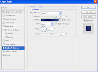
Now apply this settings to that shape (double click layer):
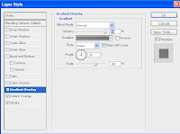
Notice that opacity is set to 95%
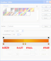
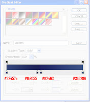
Click on gradient to edit it and set this settings:
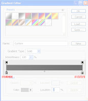
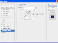
Also apply this patern, if you don't know how to do that take a look at this link: How to create a custom patern
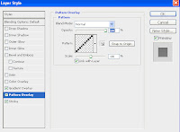
This will be visible only 5% as we set earlier 95% opacity to gradient overlay.
And last, set stroke to 1px, inside, #6c6c6c.
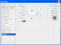
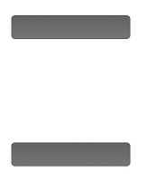
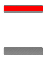
Duplicate that shape (layer) and put it to the bottom of the image, like this:
2) O.K., now draw rectangle like this one:
apply this settings:
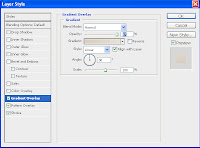
Note that opacity is set to 97%
Click on gradient line to edit it and set it like this:
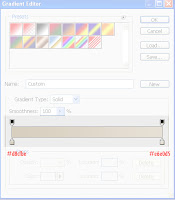
Also apply this patern, if you don't know how to do that take a look at this link: How to create a custom patern (however you should know this already as it is second time you have to do it :) )
This will be visible only 5% as we set earlier 95% opacity to gradient overlay.
And last, set stroke to 1px, inside, #d9d9d9.
3) Create 2 rectangles like this:
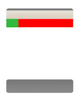
On green apply this:
color of the rectangle: #ededed
border (stroke): 1px inside #e5e5e5
On red:
gradient color: opacity: 100%
set this colors:
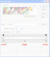
Draw, with ellipse tool, in the middle of "green" rectangle a cycle and apply this settings:
Gradient overlay:
Style: Radial
color: from #f9f9f9 to #f6f6f6
Border(stroke): 1px, inside, #9d9d9d
Set transparency to that shap (layer) to 50%.
You should now have something like this:
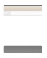
Now duplicate this 3 layers 3 times and put them one below other and on last cycle set transparency 100%, you should have now something like this:
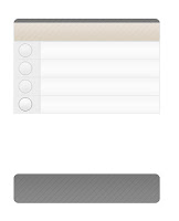
Now draw rectangle like this:
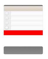
color it to: #e6e5e5
4) Now duplicate cycles and rectangles from above, change their positions to look like this:
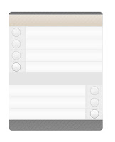
Now draw another rectangle like this:
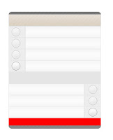
Copy style form "red" rectangle from step 3) and past it to this one (you can do that right clicking on layer selecting "copy layer style" and then pasting it to (past layer style) wanted layer.
Now put some text on you're menu, mark selected item in menu if you wish, play with colors of menu... this is what I made:
I would like to see what you have done, please pass your work in comment,
thanks!
Wednesday, February 13, 2008
Friday, February 8, 2008
Banner Ad - Create a professional 468x60 banner
Let's create a banner like this one:
1) Create new file, 468px X 60px.
2) Double click background layer and pres OK (if using Photoshop CS3 skip this step)
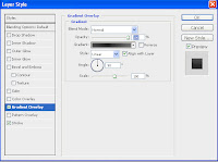
3) apply this layer styles:
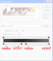
Click on gradient line to edit it and set this settings:
Add 1 px inside stroke, color: #b2b2b2:
You should have something like this now:
Add small rectangle at the beginning of the image. (how?)
a) select rectangle tool:
b) draw it like this:
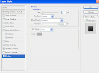
Now apply this layer style to it:
Click on gradient line to edit it and set this settings:
So now you should have something like this:
add another rectangle on the right of the image, like this:
Now apply this layer style to it (note that opacity is set to 90%):
Click on gradient line to edit it and set this settings:
Add 1 px inside stroke, color: #b2b2b2:
Also apply this patern, if you don't know how to do that take a look at this link: How to create a custom patern
So you should have something similar to this:
Add some custom text (or add your logo) to banner and you're done, here is mine:
I would like to see what you have done, please pass your work in comment,
thanks!
Thursday, February 7, 2008
web 2.0 black menu
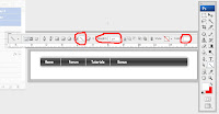
Let's create WEB 2.0 menu that will look like this:
1)
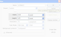
Create new document 615px X 105px:
2)
Create rounded rectangle similar to this one:
3)
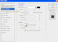
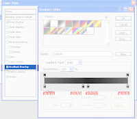
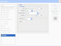
Apply this settings to the shape (double click on layer):
It should now look like this:
4) Now select font you like the most and create menu items that you need, use some light color, like white, this is how I did it:
5) Now select line tool set weight: 1px, color same as font (white?) and separate menu items as I did:
6) Select rectangle tool and draw sub menu for one (or more) of menu item, color of rectangle: #d6eed8, color of font on sub menu: black (#000000):
*You can add border to sub menu or/and create some custom shape to add accent to new menu on menu, this is how I did it:
It's always good idea to try something new, try other colors add something new, this is just a simple example!
I would like to see what you have done, please pass your work in comment,
thanks!
Subscribe to:
Posts (Atom)